Introducing microcharts — word-sized charts for React
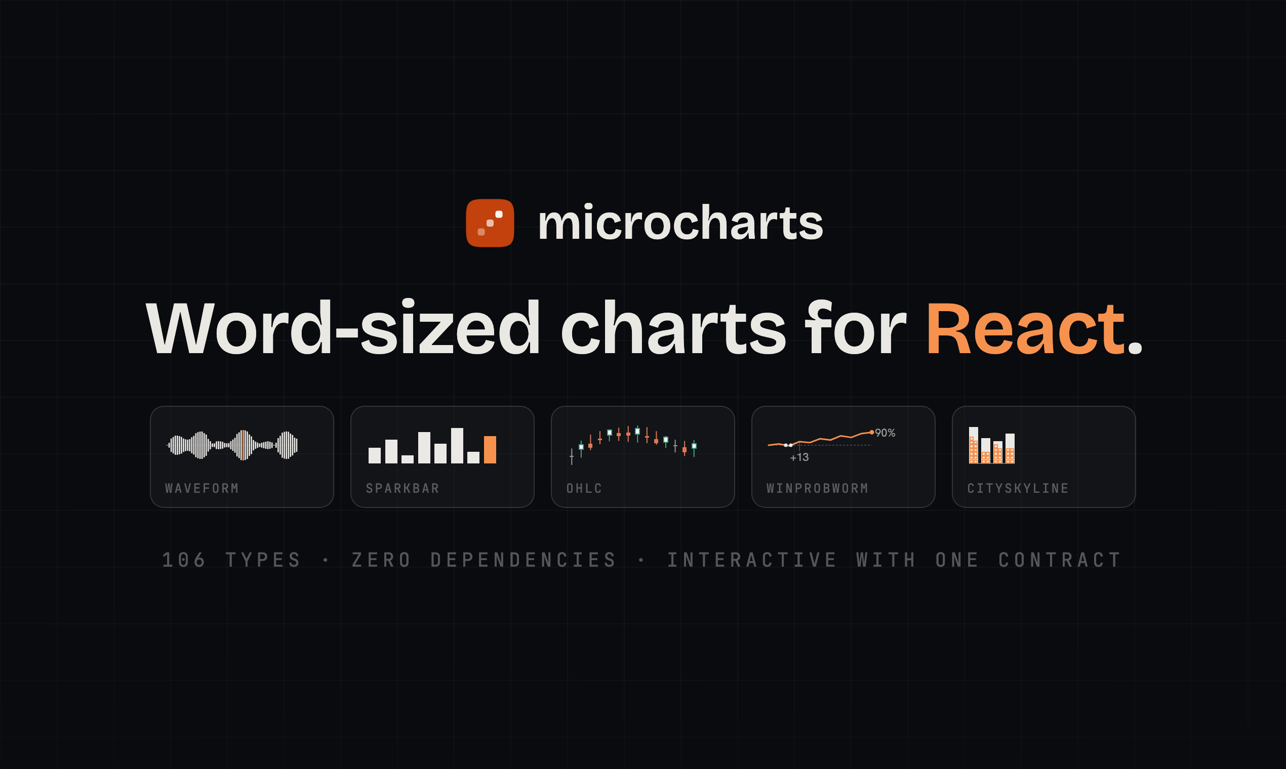
Why I built microcharts — 106 word-sized chart types for React. Zero dependencies, interactive at ~2–7 kB, accessible by default.
Here’s a sentence with a chart in it: signups climbed since March, and deploys kept their rhythm through all of it. Those are live — hover one, or click a point and the readout pins.
That’s the whole idea: charts that sit inside a sentence, a table cell, or a card, on the text baseline, without pushing the layout around. This post is about why I built microcharts — an open-source library of 106 word-sized chart types for React — and the constraints behind it.
The itch
Every chart library I’ve used assumes the chart is the page. You reach for one because you need a small trend next to a revenue number, and you get axes, legends, a tooltip engine, a resize observer, and 40 kB of runtime before the first line is drawn. So in real products we give up and type ”↑ 12%” instead.
But look where data actually lives in an interface: a table cell. A KPI card. An alert row that says error bursts are spiking on one service. A match header where the win probability tells the whole story. Tufte named this decades ago — the sparkline, a “data-word” — and the web mostly built dashboards instead.
Here’s a sampler of the catalog, rendered by the actual library:
The rules it can’t break
The library is really five rules, each enforced mechanically so none of them can erode:
Zero runtime dependencies. dependencies: {}. React is the only peer, and everything a chart engine would hand you is written in-house rather than pulled from D3: scales, path builders, stats, color math, the summary generator. That’s how a fully interactive chart lands at ~2–7 kB gzip (measured 2.18–6.94, median 5.24) and its static twin at ~1–4 kB. Every chart carries its own size budget, and a chart that gets fat fails the build.
The budget has moved once, and it moved the wrong way. A correctness pass over all 106 charts added the guards that stop a hostile prop from reaching the accessible name, and every subpath got heavier for it: a mean of 113 bytes static, 118 interactive. I re-baselined the budgets rather than drop a guard, then paid part of it back in the same release by rewriting Waterfall’s step connectors as a single path. A 100-step waterfall now ships 13.2 kB of markup across 107 nodes where it used to ship 26.5 kB across 206.
One grammar. Every chart renders from data alone; the same prop means the same thing on all 106 types. Variants are props. Annotations are children:
import { Sparkline } from "@microcharts/react/sparkline";
import { Threshold } from "@microcharts/react/annotations";

<Sparkline data={revenue} title="Weekly revenue" dots="auto">
  <Threshold y={5} />
</Sparkline>;
A new data shape is a new component; everything else is a prop. Learn one chart and you’ve learned the catalog.
That last sentence was false for a while. An audit of the prop names before 1.0 turned up four that carried two meanings across the catalog: labels was a boolean show/hide toggle on eleven charts and a list of series names on three others, total was a denominator on five charts and a bar on Waterfall, max was an item cap on three charts and the scale bound on Progress, and variant was spelled mode by thirteen charts and variant by five. A grammar with exceptions is a grammar you have to memorise, so I renamed them and shipped the breaks in a 0.x minor rather than carry the aliases to 1.0.
The third rule lives in the import path. Import from /interactive and every chart shares one contract: hover or arrow keys make a unit active; click, tap, or Enter selects it and pins the readout; Escape clears. onActive/onSelect hand you { index, value, formatted }, and readout={false} moves the value into your own UI. A KPI card wires up in one line:
Drop /interactive from the import and you get the static twin: hook-free, listener-free SVG that renders in React Server Components with zero client JavaScript, at roughly 0.01 ms per chart on the server. Five hundred sparklines come back as HTML in about 5.5 ms. The interactive chart composes the static one, so the geometry can’t drift between them.
Honest encodings. Every type has one documented encoding channel and a lie factor of 1. Delight is allowed: has a little personality, but it never changes what the data means. It’s also why a few classics sat out. A pie or a needle gauge stops reading honestly at word size, so the catalog carries the shapes that survive the shrink: progress against a target is a bullet, , where the bar, the target tick, and the qualitative band all still read at 140 pixels wide.
The rule caught me, too. curve="smooth" shipped as uniform Catmull-Rom, and uniform Catmull-Rom overshoots: a series that dipped back to zero bowed past it, and with fill on, the area crossed the very baseline it was anchored to. On a 20-unit-tall spark that is 1.33 viewBox units, 6.7% of the plot, painting values the data does not contain. A lie factor above 1 in the one place I had promised it would be 1. It runs on monotone cubic tangents now, so a smoothed line stays inside the range its own points span; seven charts grew between 8 and 129 bytes to make that true.
The fifth rule is the one the rest of this post turns on.
Every chart speaks
Each chart is role="img" and writes its own accessible name from your actual data. This demo reads the sentence back out of the DOM you’re looking at:
That sentence is read from the rendered DOM: the literal aria-label the library just wrote for this data. Swap the data and it rewrites itself.
Every one of those sentences is generated at render time, so it stays true when the data changes. The generator is fast enough (~840k sentences/sec) that it’s simply on by default. Reduced motion, forced colors, and print are part of each chart’s definition of done.
In a real interface
The real test is a surface with ten questions and six hundred pixels to answer them in. This is a release-week console for a product team, the kind of widget that normally justifies a dashboard framework:
Ten chart types, one story, no dashboard framework — a CSS grid where every cell answers one question. Every panel here is the interactive build: hover or arrow keys to read values, click to pin. Each type also ships a static twin that renders the same geometry with zero client JavaScript.
Each cell is one question and the chart type built for it: a funnel for leaks, a retention curve for the plateau, a forecast cone for “will we land the quarter”, paired A/B distributions for the latency experiment, an error-budget line for “can we afford another deploy”. Ten types, ten imports, plain CSS grid.
Charts can also drive the UI around them. Scrub a row’s trend below and the “now” cell follows; pick a service and the detail chart re-renders with an SLO Threshold and an incident Marker passed as children, in data space:
| service | p95 trend | now | wow | error budget |
|---|---|---|---|---|
| 122 ms | ||||
| 77 ms | ||||
| 358 ms | ||||
| 175 ms |
Five chart types, one table. The row sparklines pipe their readout into the "now" column via readout={false} + onActive; click a service name for its annotated detail: a Threshold and a Marker passed as children, in data space. Every piece is a separate ~2–7 kB import, sitting in a table the app already owned.
Both demos are markup a product team already writes: a CSS grid, a table, and cells that happen to contain charts.
What the sentence did next
The generated sentence had a side effect I didn’t plan. A chart is safe for a language model to write when three things hold: the grammar is small, data alone always renders something valid, and the output describes itself in words a person can check. Accessibility had already forced all three.
Getting there took a pass I had filed under accessibility. A non-finite width or domain, the kind a host produces by running Number(field.value) over an empty input, used to draw a chart that looked completely normal while its accessible name announced “NaN”. The picture and the sentence were reading two different numbers. Geometry and summary resolve through the same value now, and a config the chart can’t honour falls back to its documented default, so the scale that gets announced is always the scale that got painted. That guarantee is what makes the sentence worth handing to a model: it describes the chart that exists.
Charts in a streamed reply
The docs ship llms.txt and a machine-readable catalog.json, and the library defines a small text grammar for streamed replies: a backtick run for an inline chart, a fenced block for a standalone one:
The API recovered `microchart sparkline 12 14 13 17 16 19 22` overnight.

```microchart mini-bar Slowest builds (minutes)
web 14
api 9
mobile 21
docs 4
```
A short parser turns that into the shipped component the moment the fence closes. Watch it happen:
Hit slow motion to watch the parser work a character at a time.
Mid-stream the grammar reads as plain code, and the chart appears the instant its closing backtick lands. Half-finished or invalid grammar stays text. The reader gets either a real chart carrying its own description or the honest raw characters: never a broken chart, never invented data.
Charts an assistant can render
The grammar above assumes something on the other end knows how to draw it. Plenty of surfaces don’t: a chat window, a terminal, an editor writing a document. So the same three moves ship as an MCP server:
claude mcp add microcharts -- npx -y @microcharts/mcp
Or, for a client that reads a config file (Claude Desktop, Cursor, VS Code):
{
  "mcpServers": {
    "microcharts": {
      "command": "npx",
      "args": ["-y", "@microcharts/mcp"]
    }
  }
}
Three tools, one per move. find ranks chart types against a question asked in plain words and tells you why each one matched. get returns a slug’s real props, import paths, and a sample that renders as-is. render returns a self-contained SVG plus the generated summary — the same sentence a screen reader speaks. The catalog is published as a resource too (microcharts://catalog), so an assistant picks from the actual registry instead of its memory of one.
It runs over stdio on your machine. Nothing hosted, no key, no data leaving the process your client spawned. It carries its own copy of the library, so what it draws is what you’d ship. What it draws is the static half: geometry, labels, and the generated sentence. Hover, annotations, callbacks, and raster export all need a React tree, and a tool call doesn’t have one.
Same split as before, really. llms.txt and catalog.json teach a model to write the component; the server renders it for surfaces where there’s nothing to write into. Full reference at microcharts.dev/docs/mcp.
Theming
Everything visual routes through about two dozen --mc-* custom properties at zero specificity, so your styles always win. Presets (modern, editorial, mono, vivid, print, eink) are token bundles, and defineTheme derives a colour-blind-safe palette with dark variants from a single brand accent. The charts in this post are bound to this site’s palette. Change the accent in the corner, or flip the theme, and they follow.
Getting started
npm install @microcharts/react
import "@microcharts/react/styles.css"; // once, at the root
import { Sparkline } from "@microcharts/react/sparkline";

<Sparkline data={[3, 5, 4, 8, 6, 9]} title="Weekly revenue" />;
Each chart is its own subpath import, so you ship only the types you use. If you’d rather delegate, the quickstart has a paste-in prompt for coding agents that installs the package, reads llms.txt and catalog.json, and records the conventions in your AGENTS.md. The MCP server serves that same prompt as microcharts://agent-setup.
Numbers you can check
The sizes, timings, and quoted sentences above regenerate from the repository, and the docs are tested against the real output; a claim that stops reproducing breaks the build. Seven small example apps (a product-analytics dashboard, a finance ledger, an AI eval console among them) install the package from npm and run all 106 types in real product contexts; they’re linked from the microcharts.dev homepage.
- Gallery of all 106 types: microcharts.dev/charts
- Source, MIT: github.com/ganapativs/microcharts
- npm: @microcharts/react, @microcharts/mcp
If you ship a chart where a word used to be, show me — I’m @ganapativs everywhere.